
I'd like some feedback on this.

I'd like some feedback on this.
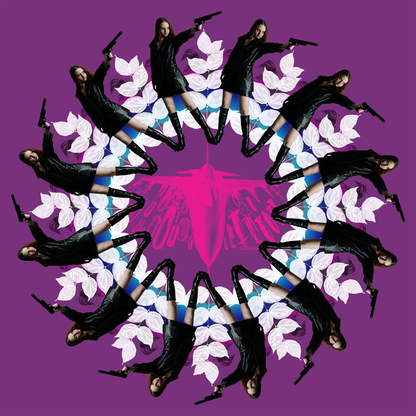
Here's a mockup of a paper back crime novel.
(Note: I don't have any particular plans for the original image. I'll probably make a mock up album cover also.)
It's cool and kinda trippy. Is this for a project or just something you're throwing together for fun?
Also, I'd like to add I fucking hate the color purple. No idea why, but I do. Why not make the background a different color like red which goes great with black and and the white pedals.
Just my humble opinion.
Last edited by no_brains_no_worries; 01-01-2009 at 08:26 AM.
Originally Posted by ozzy


I wouldn't worry about the colour too much. The image is clean, not too busy and well-executed. It is what it is trying to be, and it's not unpleasant to the eye. Good job
It looks good... but it looks kind of 60's British for some reason. Is that what you were going for?
What did you actually do?
Well, originally I was going for a sci-fi feel but changed my mind once I started.
I'm not quite sure what you mean. I guess everything besides the photo of the girl and airplane. Those were stock.
Okay, I can kinda see the Sci-Fi aspect. The way the girl in the circle looks is kinda 60's. That's what I was thinking of.
As coqauvin said, it's not busy and is what it's trying to be. The only thing I might do away with is the plane in the middle of the flower. For some reason, to me at least, it detracts from the image. Just my opinion.
 Posting Permissions

 Reply With Quote
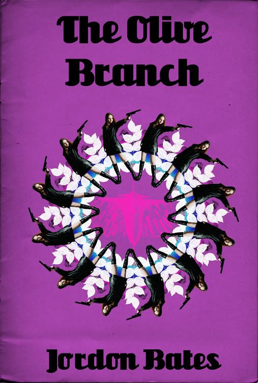


Bookmarks